Tuesday, June 12, 2018

Painting Competition

Barrels  11x14 oil

The local plein air competition has now concluded and while it was largely rained out, I found other reasons to dislike it.  I guess I really prefer a more collaborative and friendly approach to painting and I'd love to see an event that centered on painters sitting around talking with each other while paintng instead of one based on the presumption that someone is going to "win".  I only signed up at the insistence of two painting buddies who did it last year, and I assumed we would be able to paint together, but they both bugged out and went to the beach, leaving me to dutifully pack my gear around in search of some spot that wasn't overrun with the public.  While the above subject isn't fascinating, it at least provided me with a place to perch off the trail along the river, mostly out of sight from all the dog-walkers and joggers.  It's an old metal container of some sort left over from ages past, and teenage boys love to jump off the top of it in the summer, ignoring the signs that tell them not to do just that.  I did make an effort to include some softer edges, as I have recently realized (how slow I am to learn!) that edges are perhaps my biggest weakness.  

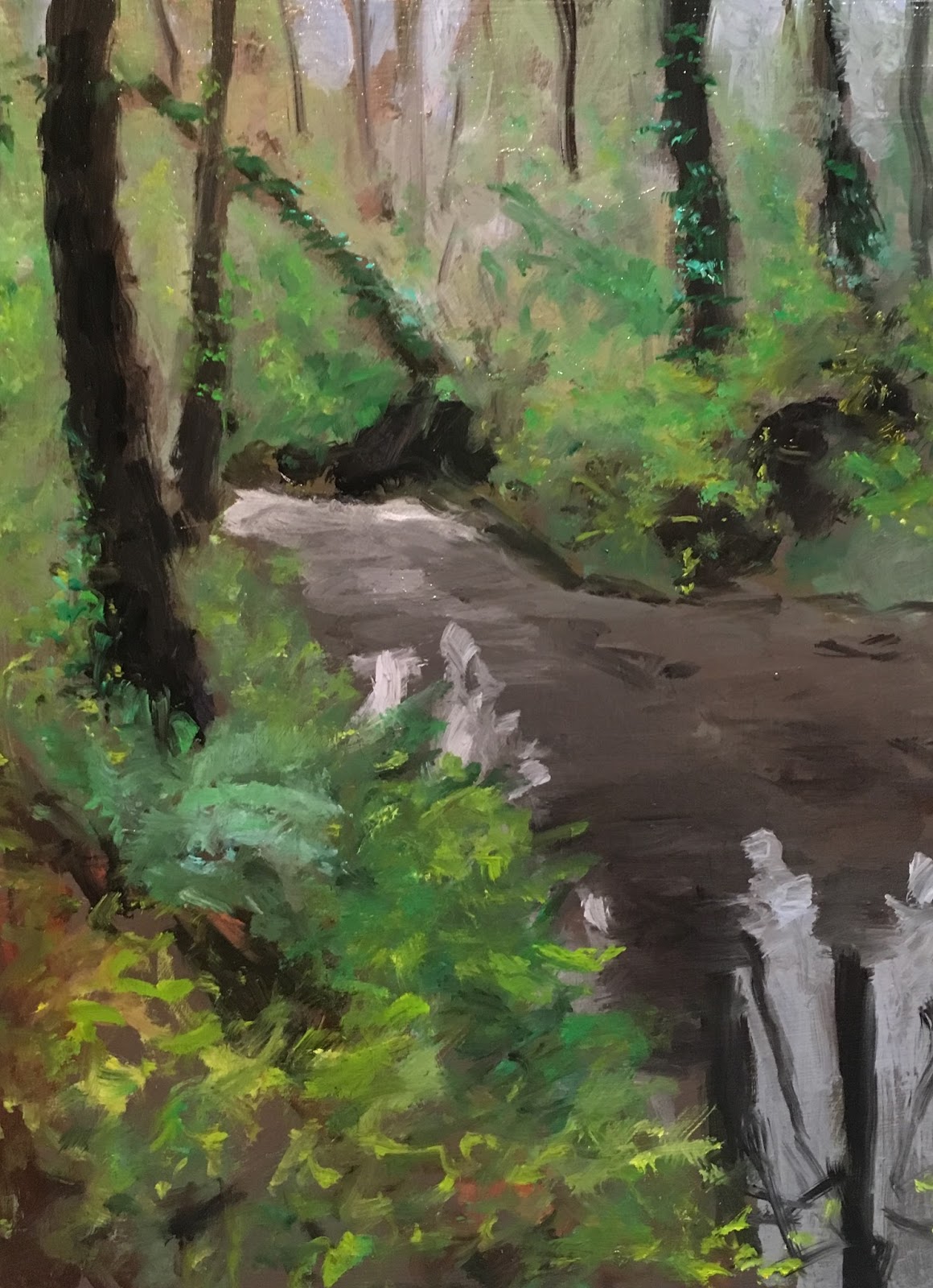
A second piece I will also submit (and I'm only submitting anything at all just to force myself to expose my insecurities) is this one from just down river at Tryon Creek Cove.  We go there sometimes to let the dog swim, even though there are signs that tell us not to do that (I guess there's a teenage boy in all of us somewhere.)

Tryon Creek Cove 11x14 oil

One thing I would do better to avoid in painting plein air is anything architectural or structural.  It's so hard to make straight lines in the field.  And water, as always, is so hard.  In the end I find myself slipping into mindless automatic mode, slapping dashes and lines in an effort to create movement.  I know that there is a time pressure outdoors, but if I can't find a way to slow down and use more care in my work, I'll never be able to move forward.  And yet that's one of the nicer things about plein air, because there isn't time to get precious and it's the impression that counts the most.

End of the Trail 16x20

I include this last piece only because it began with such hopes, and then part way through it I realized that I had wanted the little bridge to be lower in the composition, so that the entry into the dark wood was a focal point in a better location.  As it is, it seems to get lost a little.  I stopped working on the tall grasses in the foreground and I almost considered starting over on a new panel, but the rain came.  I might give this one another go someday.


Tuesday, June 5, 2018

Same Old Haunts


Phantom Bluff 16x20 oil

The Paint Out in Lake Oswego is only a few days away now, and there isn't much time left to sharpen up my dull blade of a skill in plein air painting, so I scamper down to the boathouse to paint yet again the familiar scene.  There is always something different about it; at the very least the surface of the water changes throughout the day.  But it also seems like I'm painting the same painting over and over again.  I make an effort to simplify, get rid of extraneous detail, focus on values, try to direct the attention from here to there.  The morning light hits the bare rock on the bluff and brings out the pinks and mauves and the rusts and mint greens of lichen, and maybe one day I will be able to match those colors and find a place for them in a painting, but for now the struggle is just to find the right greens to differentiate the far and the near evergreens.

Saturday, June 2, 2018

Rob Adams


Sometimes I stumble across the website of a painter previously unknown to me and it feels like such a treasure trove of exciting images.  Rob Adams is a British artist whose skill at drawing and composition and color is fascinating to see.  All of the images in this post are from his website, and it is a tiny sampling of what is to be found there.


It is clear that he is adept at the use of pen and ink, drawing with washes of color, watercolor or oil.  His grasp of perspective in architectural rendering is impressive.


A big bonus is that he also appears to be quite prolific, and he posts frequently to his blog. I find myself envying his lifestyle, which seems to include a great deal of travel and painting on location with friends.


Friday, May 25, 2018

In the Field


It's been time to get out and about, with balmy days and time enough to scout locations.  Yesterday Randall Tipton and I drove out to the gorge to paint near Herman Creek at a quiet little spot I discovered last year, but the Columbia River was so high that we couldn't get to the location I had in mind without wading through water covering the trail, so we found a little spot of shade and made do.  Here is a shot of Randall painting in one direction while I painted in another:


A few days earlier we had been to a plein air demonstration by Leland John on the campus of Clackamas Community College.  It was interesting to hear the stories of someone who has painted outdoors for much of his long life.


I'm glad to see that more and more people are discovering the pleasure of painting outdoors, but it's still a rarity to run across a painter in the wild; golfers and fishermen still outnumber us by far!

While not every painting is a success, it seems that frequently enough there is something to notice in these works, either an idea to be developed, color to be recognized, or even a glimpse of the feeling one had on site.  


Monday, May 21, 2018

Grisaille Method

Virginia Wolf 11x14

I am investigating the classic method of underpainting the tones in raw umber and white, reserving all other color for glazes once the underpainting has dried, and I can see merit in the system, though it takes a lot longer than the alla prima method.  It does focus me on the form, learning how to turn through gradual blending, rather than being distracted with involving change in color temperature as well.  I will see how this turns out once the color phase goes on.


The thing about painting, whether outdoors or not, is that it is guaranteed that there will be duds along the way, and I have run into a series of them lately.  Sometimes the original idea is exciting, but somewhere along the process it begins to fade, and the result, while bearing the fruit of some aspect of the idea, like color or mood, is not a finished painting.


Wednesday, May 16, 2018

Suffocating in Green


While walking the dog this morning, I paused in the midst of the forest and looked around at the sea of green: everything was nearly the same green, the ground had a green cast from the reflected light, the light itself bounced around green, and though it was as delicious as a Kurasawa film, and the richness of the color was as stunning as a club to the head, there was no way to paint it.  I might as well just use a house brush and cover the canvas with the one color.  There were slight variations in tone, and little details everywhere the eye moved, but it was too, too much.  Spring has arrived and suddenly the world is a green jungle; the trails are overgrown, the ferns are as thick as herds of sheep, and I find myself walking with one arm raised in front of me to ward off the spider webs that are now suddenly crisscrossing the path.  Life asserts itself and I have to take a step back to reconsider my approach to this dance I have been dancing, where Life shows something wonderful and noteworthy and I try to find a way to translate that into paint, all the while trying to learn the language necessary to talk with a brush.


I have been trying to get out more, paint from life, and work up speed while doing it.  One of the readiest subjects is down at the lake, where I can at least lounge in a chair while painting familiar subjects like Phantom Bluff.  I'd say it was taking the lazy way out, except for those 290 steps on the climb back up to the house.  Some of the work I have done outside seems like a failure until I look at it under proper light, and then I see a little something in it of value, something about the quality of the color and the light effect, but in the end, many of these fall short because they are a little brutish and roughly painted.  Painting is a pasttime that is constantly humbling (much like golf) and it takes real dedication to a goal not to become discouraged.

Thursday, May 10, 2018

Pseudo Plein Air


11x14 oil

In preparation for the upcoming plein air season, and with rainy weather interfering, I take what little painting time I have had to try to quickly lay in impressions of a landscape.  It is not ideal, but it is dry in the studio.


5x7 oil

Also in preparation for painting outdoors, I decided to prepare a stack of panels on which to paint.  I started with some 2 foot by 4 foot sheets of 3/16" plywood I picked up at Home Depot.  They are a lot easier to handle and haul than 4x8 sheets.  I first painted them with house primer on both sides to seal out moisture and keep them from warping.  I had some old house paint with a primer in it in a rich burnt sienna tone, and I suppose I could use that as an underpainting, but I preferred to let that dry and then apply a coat of white gesso on top of that. 


The primer was applied with a regular roller, but I spread the gesso with a six inch hot dog roller, with a finer nap leaving a smoother finish.  Once dry, I sanded all the sheets with a finish sander, then cut them up on the table saw into various sizes I will want.  Out of ten 2x4 sheets (cost $70) I ended up with two 18x24 pieces, nine 16x20, twenty 11x14, twelve 12x16, six 8x10 and ten 5x7.  Those probably would have cost $400 had I bought them from an art store, and I do love a bargain.


Friday, April 20, 2018

Portrait Scaling Two


Sometimes, for me, likeness is the central most important goal in painting a portrait; it is a measure of one's skill and opens the way to better work.  But occasionally, as in the above piece, the likeness falls short and then is abandoned because I stumble onto something else that seems interesting and I don't want to lose it by badgering the painting toward a better likeness.  I was working again on Puccini and was listening to one of his operas as I painted, and it may have been the power and emotion that came through the music or I may have followed what I thought might be an ideal of male beauty, but this face is not exactly Puccini, though it might be a man with his music in him.

At any rate, it was a piece of the puzzle in trying to find a way to a better painting of the man.  In the last post, I mentioned a few of the ways painters work toward laying out the features of the face, and I failed to mention very many of them, though I'm sure I'm not even aware of all of the possibilities.  Perhaps the most common one is the drawing of the oval shape and the line down the center with horizontal lines drawn to mark the location of the top of head, chin, eyes, nose and mouth.  This is an easy way to get a start, but it is based on the notion that everyone shares the same structure, and one needs to make alterations to the norm based on the individual being painted.  It is very useful in sketching quickly and in locating the features when the head is tipped one way or the other, turned to the side, etc.

Another method is to paint in a large shape representing the head, then dark blotches for the eye sockets, then carve at it with other features, closing in on the location of the various bits by feel.  Other artists start with an eye, then locate the other eye, then the nose, etc. based on what they have painted so far, and I find this one of the most difficult for me, leading to gross distortions.  In fact, I tend to use a variety of approaches, sometimes one or the other, sometimes several in concert, and I think the important thing is just to continue the effort, the practice, because the body does learn something along the way and accuracy seems to be a result of continued effort.


When I am struggling to understand a face, I often turn to pencil or charcoal, too, since anything that leads to an understanding of the structure is helpful.  And when a likeness is off, it is frequently the basic structure that is not quite right, something that is very frustrating when one has spent a lot of time nagging at the details.

With the return of the sun, finally, I have been able to make it outdoors to work on plein air skills and watch the birds and the changing light.  The lake is full again and the boats are buzzing by.  Yesterday I was down on the deck at the boathouse painting when some friends stopped by in their boat; it felt very civilized to mix the two things.


It's tricky to paint water when the light keeps changing so rapidly.  The breeze shifts and suddenly what was dark green is now light blue, or the transparent deep water is suddenly an opaque surface.


Sunday, April 15, 2018

Scaling Up A Photo


Puccini 16x20 oil

In painting portraits, one of the biggest challenges is achieving accurate measurements, because without precision, it is extremely difficult to arrive at a reasonable likeness.  There are myriad ways to measure when painting, with perhaps the most classic being to hold a paintbrush with thumb on handle and stretch your arm out toward the subject, measuring a distance - say, the width of a head - and then translating that distance to the canvas.  I have struggled with this method because it is hard to hold one's arm out at exactly the same distance each time and translate it to the canvas in exactly the same way, and so it involves much trial and error and I am often not happy with the result.  

When working from a photo reference, many painters will sketch out a grid over the photo and then sketch the same grid over their canvas, only on a larger scale, thus scaling up the photo.  But this method involves laboriously copying the marks and lines in each square, and for me, it doesn't feel much like drawing naturally.  Also, it requires that you print out the photo or else create a transparent sheet with a grid on it that you can tape to the front of your computer screen.  Since all the photos I work with these days are digital and I almost never print something out, this approach just feels too cumbersome.

There are specialty dividers one can buy or make, so that you measure the distance on the subject and the dividers automatically make the other end of the device some increment larger, but I have to admit I have never tried this method.  I might one day make up a set of these dividers in the shop, but they seem unnecessary when I have my go-to method already available.

In painting portraits from photo reference, I almost always rely on an engineer's scale - that triangular ruler that you can find in an office supply store.  It has six scales -10 through 60, and I used it in the past to draw plat maps for building projects.  A building lot is usually too large to use an architect's scale - those with 1/8"/foot, 1/4"/foot, etc.  and the engineers scale allows each inch to represent 10 feet, or thirty feet, or sixty feet, meaning you can get a big plot of land on a small piece of paper.

But for scaling up a photo, I find it is just as useful.  The first step is to crop the photo to make sure that the aspect is the same as your canvas.  For example, if you are using an 8x10 board, make sure the photo is cropped to an 8x10.  Then you need to find which scale comes closest when you measure it on the computer screen.  Most photo software will allow you to enlarge the image in small increments, and I typically begin by holding the engineer's scale against the image and enlarge it until the width matches the width of my canvas.  Once I get it to the right size, I can begin to transpose those measurements I want.  For a portrait, I usually want to find the placement of the major features of the face, so, for example, I put the zero mark of the scale at the bottom of the chin and make note of where the scale hits the top of the image.  I then transpose this measurement to the canvas.  For a portrait, the most important measurements for me are the chin, the top of the head, the mouth, bottom of the nose and center of the eyes.

Working from one side of the image, I measure for the sides of the head, the center of the nose, the width of the mouth and the side of each eye.  If you want to find the exact placement for any particular point, you can measure from the top and from the side and make a mark for that point on your canvas.  

In this case, I was using the 30 scale, meaning that when I transferred the marks to my canvas I was increasing the measurement by three times, since I switched to the 10 scale for marking the canvas.  (I try to use a red pencil for drawing because it doesn't dirty up the paint like a graphite pencil will.). Once I have located my major points of reference, I can sketch in the entire head, and then if something seems off, I can double check it with the scale to see where I am wrong.


I find that locating only the critical points helps me to quickly avoid gross errors and yet allows me to sketch more naturally for the majority of the face.  Often I will skip the measurements entirely and just sketch first, only checking with the scale if something seems off.  I feel that having done this repeatedly over time has strengthened my ability to sketch accurately without measuring, but it is not something that happened overnight.  Miles and miles of brushwork....


Once I have the basic sketch, I can begin painting without the fear that I will have to go back and try to move features around once the paint is down.  A quick block-in covers the canvas.


For this painting I used a limited palette of cadmium red light, gold ochre, ivory black and white.  I used Neo megilp instead of Liquin as a medium in order to leave the paint open to blending for a longer period, but now I want to wait for it to dry so I can go back to it and make corrections, since inevitably, the likeness is still off.

A final note:  if anyone decides to get an engineer's scale and try this for themselves, I should add that sometimes it is hard to find a scale that works for your canvas, and one trick I have found is that you may need to scale from 50, say, to 20 instead of 10.  That allows you to increase the measurement 2 1/2 times rather than just two or three or four.  You might need to scale from 30 to 20, or 60 to 50, or whatever works.


Friday, April 13, 2018

April Showers Bring May Showers


The Canal 8x10

The wait for sunny spring weather seems to go on forever, with rain every day, it seems, and I am ready to venture out for some painting outdoors, but the wait goes on.  Little sketches in the studio are one way to warm up, prepare for the outdoors, and I try to work quickly and loosely like I will be outdoors, and while it may not produce anything for the wall, it adds to the miles of brushwork.


Puccini 5x7